widhh.com
After an intensive year of working closely with the Western Institute for the Deaf and Hard of Hearing (WIDHH), we launched www.widhh.com to bring in the New Year.
The Western Institute for the Deaf and Hard of Hearing (WIDHH) is the largest non-profit agency of its kind in Western Canada. In operation since 1956, WIDHH strives to offer high quality services to Deaf, Deafened and Hard of Hearing individuals through innovative products, services, and programs that help to promote accessibility equal to that of the hearing public.
Visit: www.widhh.com
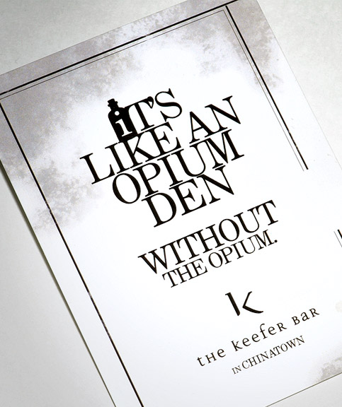
The Keefer Bar Flyer
It’s the middle of April, the Vancouver Canucks just won their first playoff game for 2010! Since the beginning of the year till now, we’ve been busier than ever with lots of new portfolio pieces to add. To start, we’d like to announce an exciting new client, The Keefer Bar in Vancouver Chinatown. The bar is a great addition to the changing landscape of one of Vancouver’s oldest and most vibrant neighborhoods. The Keefer Bar nested on the ground floor of an updated century old heritage building is perfect with an apothecary twist! The bar having just opened on the eve of the 2010 Winter Olympics, we developed a tag line and visual language to help garner instant attention. Not wanting to give away too much, our solution was left to your imagination.
Stay close as we have much more exciting studio news for you.
Definium Design Vancouver
Website Launch!
Wow! We’re excited that you’re here to read about the debut of our newest brand extension, www.definium.ca. Exactly one year ago, we wanted to bring you a design that was rich with information yet modest and fresh in its visuals. A site crafted that you could explore and dive in and out of.
The ideals were set to mirror the definitions of our design studio, from who are we to what we do, and what we’re capable of doing. We continued to apply our “less is more” design approach to reflect our creative philosophy and how we applied that to our practice. Adding to the challenge, we really wanted to see how little of elements we could use before the site design loses its effectiveness and appeal.
Our answer is a design uniquely broken into apparent blocks of information. It’s a play on visual space, allowing a variety of ways to place supporting content. Throughout the design, we considered a sense of depth; a user can skim the surface or move deeper into an array of detail. This is present in the typeset and in the structure of the pages.
The site like our name reflects the duality in what we do, the merger of art and commerce, the challenge of creativity and science. We imply the notion of a textbook; a manual for learning that is symbolic to our premise yet provides reading functionality. Adding to the mix are subtle hints of aesthetics and minimalist graphics, making a combination of visual and written language for you to decipher.
It’s been 365 days in the making and we hope you enjoy.
-Chris Chan + Kevin Mak
Ps. Make sure to join our Facebook Fan page or subscribe to our updates. In the weeks to come, we hope to share some ‘behind the scenes’ with this project. Till then!
Breasts and Cancer: Ads too sexy?

However, she get’s an A for effort and a D for, well, her boobs.
– Trevor Lee
Trevor, a brand strategist and planner, believes a brand is the most important asset a company must manage to create a sustainable competitive advantage. To him, almost everything else falls under the brand umbrella.
Trevor holds an M.Sc. in Strategic Marketing from Cranfield School of Management, and a B.A. from the University of Waterloo.


 Copyright © 2009 All Rights Reserved