
YTS 2011 Design
This year marks our 6th installment in crafting the artwork for the annual Youth Talent Showdown in Vancouver Chinatown. In the 5 years we’ve been working with the VCBIA, there’s been a lot of positive change for the neighborhood.
We believe that this year is yet another opportunity to further change and move forward, so we wanted to put the Chinese back into the artwork with hopes of reaching out to a new audience and attracting a diverse range of talent and performers.
As this is the year of the rabbit in the Chinese calendar, we believe the rabbit should take centre stage in the design. The last 2 YTS’s has been a dance format and this year YTS has switched back to a multi talent show where you don’t know exactly what performances are going to take place. It is this thought that drives the concept for this year’s poster.
The idea is a play off Alice in Wonderland where you chase this rabbit down the rabbit hole and it’ll lead you to this place of magical performance. We wanted a design less rational and more imaginative and theatrical. Hence you don’t see a typical rabbit. The main features of this rabbit is its boxed head and top hat but clearly it’s a rabbit because of it’s ears and body.
As YTS is a competition, we’ve included some fun elements such as the ‘target’ tail and boxing gloves. The rabbit is faced forward but looking back at you as it’s ready to go, but be warned that if you should catch him, he might pack a punch.
The colors we’ve selected reflect the traditional Chinese black ink and subtle red – included is the Chinese character for longevity and a hanging Chinese decoration off his ruler.
As Van Van has his brush, we felt that this rabbit should have something similar in idea and that is his ruler. It’s a symbol of measurement and if you’re going to perform, the rabbit is going to judge you. Plus, the ruler in a lot of cultures is an icon of discipline, if you don’t behave so well, you’re going to get a lesson.
Lastly, the type treatment we’ve applied for the ‘Youth Talent Showdown’ mimics a pop up circus sign – if you can imagine a desert with it’s circus tents and elephants and this big light flashing sign that just says ‘come on down’. There’s the twirl and swirl of the lines, as if you’re falling down the rabbit hole. All in all, this year’s poster design is meant to be fun.
Not to forget! Our shout out to Jennifer Duong for her amazing illustration contribution to this project. We couldn’t have pulled it off so successfully without her!
I’ hope to see you all at this years TD Youth Talent Show!
Definium does Dragon Pedicab
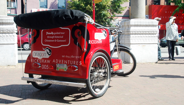
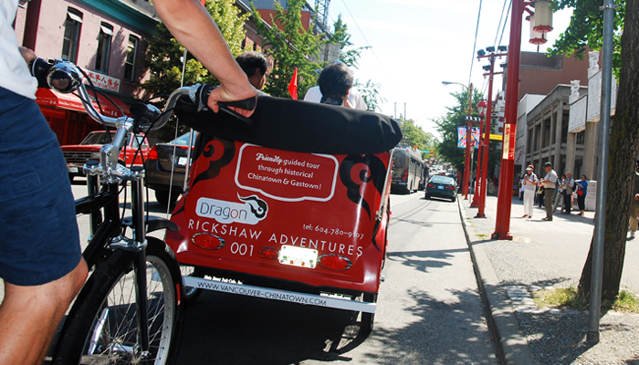
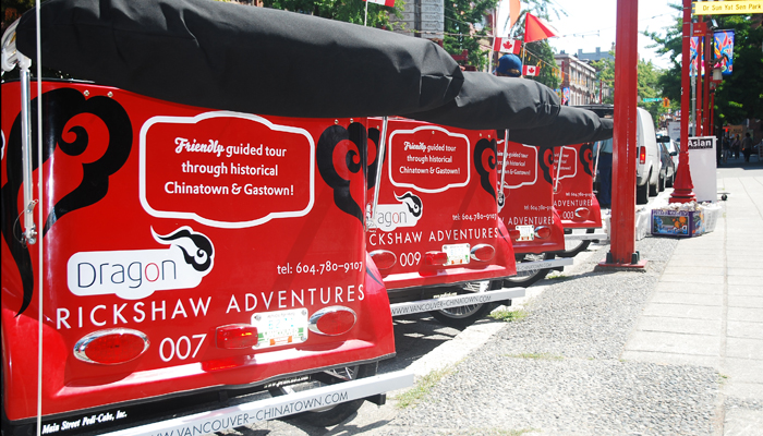
If you’ve seen them around Vancouver’s Downtown streets picking up tourists during the day or delivering party goers at night, Dragon Pedicab Adventures will take you on a relaxing city ride. Definium Design is proud to work closely with the Vancouver Chinatown Business Improvement Association on another project, this time on the design of the identity of Dragon Pedicab Adventures, tailored to indulge passengers on a modern day rickshaw tour through Vancouver’s heritage rich neighbourhoods, Coal Harbour, Downtown Vancouver, Gastown, and Chinatown.
Japan is McLovin' the "No-Brand" 1/4 Pounder
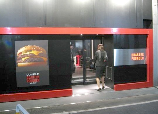
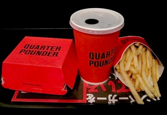
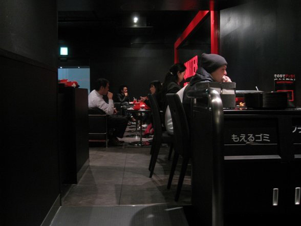
No golden arches, no clowns or brightly coloured, indigestible fry guys McDonald’s Japan has decided to go black, red and cool with their limited menu pilot stores.
Well when you thought the big corporates are bland and boring, it’s nice to see a family oriented franchise do something a little unconventional.
Will this minimalist Boy’sco concept work? I hope so! Hoping that they will start opening up stores in Vancouver just like this. We do have a booming young Japanese population looking for a taste of home!
“McDonalds Japan is testing the waters of no-brand marketing with newly opened Quarter Pounder stores in Tokyo.
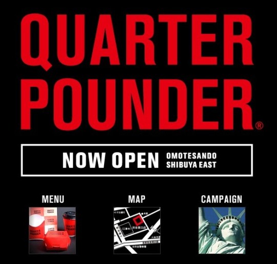
Generic packaging, minimalist decor, a two-item menu – and not a clown in sight! That goes for the website as well. McDonalds Japan’s dip into no-brand marketing comes as quite a shock to those who see the global burger master as the poster child for brand name advertising.
Word is, curious customers are lining up to get into Quarter Pounder’s stark black & red shops. When they finally squeeze through the door, menu choices can be arrived at by a coin flip: a Quarter Pounder with Cheese Set for 500 yen (about $5.15) or a Double Quarter Pounder with Cheese Set that goes for 600 yen (about $6.20). It’s been noted by some that McDonalds burgers are smaller in Japan, so take that into account before judging whether either set is a good deal.
That’s it! No shakes, no pies, no super-sizing, no Happy Meals. Not even a cheery “fries with that?” since they come included with each set.”
Will McDonald’s Quarter Pounder concept work? And, how long before trend-savvy Tokyoites realize that beneath the shiny new wrapper is the same old burger?
Optimus Tactus Keyboard

Optimus Tactus does not have physical keys, which means there are no restrictions on their shape and size.
Any part of the keyboard surface can be programmed to perform any function or to display any images.
http://www.artlebedev.com/everything/optimus-tactus/


 Copyright © 2009 All Rights Reserved