
Color of 2009 – Mimosa
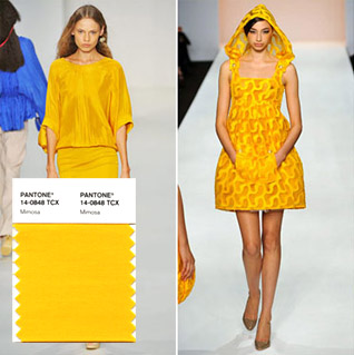
Yellow has always been a great color. Mimosa with it’s lean of red and tint towards black is sturdy and confident. Color of 2009 or not, we’ll most definitely try variations of it.
-Definium-
From www.pantone.com
Pantone Selects Color of the Year for 2009: PANTONE 14-0848 Mimosa
Mimosa Embodies Hopefulness and Reassurance in a Climate of Change
CARLSTADT, N.J., Dec. 3, 2008 – Pantone, an X-Rite company (NASDAQ: XRIT), and the global authority on color and provider of professional color standards for the design industries, today announced PANTONE® 14-0848 Mimosa, a warm, engaging yellow, as the color of the year for 2009. In a time of economic uncertainty and political change, optimism is paramount and no other color expresses hope and reassurance more than yellow.
“The color yellow exemplifies the warmth and nurturing quality of the sun, properties we as humans are naturally drawn to for reassurance,” explains Leatrice Eiseman, executive director of the Pantone Color Institute®. “Mimosa also speaks to enlightenment, as it is a hue that sparks imagination and innovation.”
Goodbye Arial, Hello Calibri
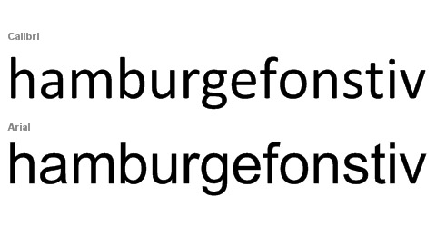
(For everyone that wasn’t aware)
In Microsoft Office 2007, Calibri replaced Times New Roman as the default typeface in Word and replaced Arial as the default in PowerPoint, Excel and Outlook.
Calibri was designed by Lucas de Groot for Microsoft to take advantage of Microsoft’s ClearType rendering technology. Calibri won the TDC2 2005 award under the Type System category.
We say, “Change is nice”.
Break A Leg
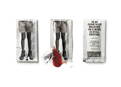
More like blow your leg off. Perhaps a little too visual? We thought this is a great showcase of communication design. A great idea by Publicis Mogo to support the CALM campaign (New Zealand Campaign Against Landmines).
Japan is McLovin' the "No-Brand" 1/4 Pounder
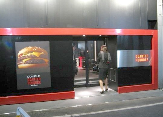
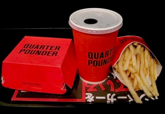
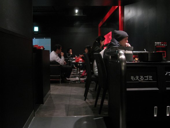
No golden arches, no clowns or brightly coloured, indigestible fry guys McDonald’s Japan has decided to go black, red and cool with their limited menu pilot stores.
Well when you thought the big corporates are bland and boring, it’s nice to see a family oriented franchise do something a little unconventional.
Will this minimalist Boy’sco concept work? I hope so! Hoping that they will start opening up stores in Vancouver just like this. We do have a booming young Japanese population looking for a taste of home!
“McDonalds Japan is testing the waters of no-brand marketing with newly opened Quarter Pounder stores in Tokyo.
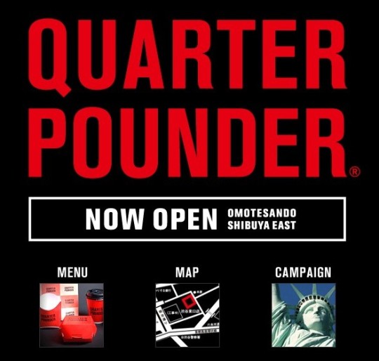
Generic packaging, minimalist decor, a two-item menu – and not a clown in sight! That goes for the website as well. McDonalds Japan’s dip into no-brand marketing comes as quite a shock to those who see the global burger master as the poster child for brand name advertising.
Word is, curious customers are lining up to get into Quarter Pounder’s stark black & red shops. When they finally squeeze through the door, menu choices can be arrived at by a coin flip: a Quarter Pounder with Cheese Set for 500 yen (about $5.15) or a Double Quarter Pounder with Cheese Set that goes for 600 yen (about $6.20). It’s been noted by some that McDonalds burgers are smaller in Japan, so take that into account before judging whether either set is a good deal.
That’s it! No shakes, no pies, no super-sizing, no Happy Meals. Not even a cheery “fries with that?” since they come included with each set.”
Will McDonald’s Quarter Pounder concept work? And, how long before trend-savvy Tokyoites realize that beneath the shiny new wrapper is the same old burger?
Herb Lubalin, one of the greats.
http://www.typogabor.com/herb-lubalin/
When I look at some of Herb Lubalin’s work and pull up his fonts on my font list, a certain chord is struck. Herb Lubalin’s work, I would say, is summed up in the name of his most credited typeface, Avant Garde. He was ahead of his time creating trend-setting and iconic images through his typographic creations. The “wiftly” gestures of his alternates, the sex-appeal of placement between type form and image, and the modern taste and wide, yet familiar adaptability of Avant Garde.
Herb Lubalin my hat goes off to you.
“Herbert F. (Herb) Lubalin (1918 – May 24, 1981) was a prominent American graphic designer. He collaborated with Ralph Ginzburg on three of Ginzburg’s magazines: Eros, Fact, and Avant Garde, and was responsible for the creative visual beauty of these publications. He designed a typeface, ITC Avant Garde, for the last of these; this distinctive font could be described as a post-modern interpretation of art deco, and its influence can be seen in logos created in the 1990s and 2000s.”
http://en.wikipedia.org/wiki/Herb_Lubalin
Optimus Tactus Keyboard

Optimus Tactus does not have physical keys, which means there are no restrictions on their shape and size.
Any part of the keyboard surface can be programmed to perform any function or to display any images.
http://www.artlebedev.com/everything/optimus-tactus/



 Copyright © 2009 All Rights Reserved